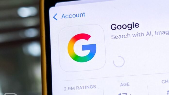
Recently, many users have spotted a subtle change in Google’s branding. The capital “G” logo now includes a soft gradient. This new look smooths the transitions between the four colors, giving the design a modern and fluid appearance.
The change is already visible on the Google app for both Android and iOS. However, it hasn’t replaced the classic version everywhere. Several places still feature the traditional solid-color logo. For instance, the Google browser favicons remain the same. Additionally, the classic logo still appears in Google’s official press materials.
This gradient update appears to affect only the Google app so far. Other Google apps for smartphones haven’t yet adopted the new design. Interestingly, Google’s Gemini AI assistant does feature a slight gradient on its branding. This could suggest that the company is testing the gradient look with its AI products.
It’s unclear whether this update signals a permanent redesign or if it’s part of a test. Google has previously made major branding changes, and these usually come with big announcements. For example, in 2015, the company introduced a full campaign explaining the details behind its logo refresh. However, this time, Google has rolled out the change quietly, without much fanfare.
One possible reason for the soft launch could be that Google wants to test user reactions. By rolling out the gradient logo in limited spaces, the company can gauge how people respond before making a broader change. It may also be a small step in a larger redesign effort, with more updates coming soon.
While these changes may seem subtle, they could signal further shifts in Google’s branding. As the company continues to evolve, we may see the gradient style spread to other products. For now, though, it remains unclear whether this update is permanent or just a trial.
Foe more tech updates, visit DC Brief.


